Friday, June 28, 2024

Allein Gegen Die Mafia


Alone Against The Mafia

If Allein Gegen Die Mafia looks familiar, it's based on an old ZX Spectrum called Saboteur by Clive Townsend/Durell Software.
Developed using GFA Basic by Diethard Zellmann in 1990 and translated into English by me (okay, the web helped too). It only works in monochrome and isn't something I'd heard about until a while back (greetings Jim!).

The narrative was changed... just enough... possibly to stop Clive from getting annoyed. This time we aren't a ninja but a secret agent for the police force. It's our mission to infiltrate the Mafia's hideout and destroy their computer and secretive data. Oddly, their headquarters look very much like those in the original but, if you keep quiet, so will I.

Let's pause this boring read to gander over a couple of screenshots bursting with colours...


Right, we've arrived and are ready for action. Bring it on, Mafia boys!


Hardly a ninja! I practice with the controls and end up looking like a knob.


Gameplay

The moment the game begins, it feels familiar yet excitingly surreal. Fans will note that the mafia's lair is remarkably faithful. Many rooms have slight visual changes here and there, but the overall layout remains comparable. Quite a feat!! This also applies to the enemy placement albeit less so. I remember the Speccy game having more guards (?)

Arriving on a dinghy, we climb onboard dry land and immediately begin to notice that there are only two types of enemies; guards and dogs. Our four-legged friends will chase but, the soldiers remain still, reacting only when you're within their line of sight. So, in true ninja style... sorry... in true secret agent style, explore carefully using stealth and tactics. If you enter a room and see a guard, but are unarmed, leave. He could be facing the other way when you return (/tip).

The mafia's hideout is large with many areas to explore. However, several doors are locked thus blocking access to further areas. This is probably the only puzzle element in the entire game. These locked doors have an ID number. Remember that number. To unlock seek the corresponding computer terminal with the associated number.

To succeed in Allein Gegen Die Mafia, you must be stealthy and quick on the draw. Explore carefully and unlock doors only as and when you need to. Don't waste time blindly roaming around, have a plan. And while you're there, look for bricks to throw at the guards. That never gets old! Of course, a gun is much better - with limited ammunition.

Fancy a couple more screenshots? I hope so because here they are...


Oh no, that guard is facing the wrong way and will kill you. Find another route!


The guards are tough but I'm tougher. He's dead and I'm alive. What more do you need to know?


Interface & Controls

The status panel is just like the original. On the left are the items you have found and currently carrying (limit of one removed). On the far right you shall see an empty box, this will only display an item if nearby. Next to that is the timer, I hate timers but this one isn't so bad. Finally, along the bottom, you shall notice the replenishable energy bar.

This bar begins to zap with every move and falling great distances also has an impact. However, I'm not sure it was needed because a single shot from a guard kills instantly - regardless of your energy level.

Ditch the joystick. It's a fact, that secret agents are best controlled with the keyboard. He can run, leap, and shoot/throw objects. Unlike the Speccy game, there are no fighting moves. I guess that's why we're not a ninja now?

The keyboard control might, initially, appear awkward? They're not as bad as you first assume. Well, yes they are. No, they're not. Look, it's gonna take a couple of go's before you fully grasp it. Practice makes perfect. He says...


cursor left = run left
cursor right = run right
cursor up = climb up
cursor down = climb down
shift + cursor left = jumps left
shift + cursor right = jumps right
shift + cursor up = item pick up
shift + cursor down = item drop
spacebar = fire gun or throw an object
shift spacebar = use computer when at a terminal or switch weapons


Aesthetics

Saboteur is, effectively, a game of little colour so black & white offers the perfect ambience. Hey, at least there's no colour clash!! I love the backdrops that use a repeating tiled effect, copying the original idea well. Also, the characters look good with extra details in high resolution. However, I still find it odd that the guards don't walk - like they're skiving, frozen solid, or waiting for trouble to come to them! Still, without combat moves that makes sense, I guess?

The audio is very, very light on the ground with only a few spot effects - for the gunfire and sadly, nothing for footsteps. In fact, almost all the gameplay is silent which, I fear, heavily detracts from the atmosphere. Disappointing.

Enough yapping, let's see some more sexy secret agent screenshots...


Deeper into the adventure I find a room with an exit sign. Surely a trap?


Talk about overkill, I accidentally killed the guard with dynamite. Sod it, I'm still leaving!


CryptO'pinion

When I began playing, I thought this was nothing but a lame ripoff. I wasn't happy with the controls or instantaneously getting killed by the guards and having to restart from the beginning. Thankfully, I didn't walk away and translated the instructions. Once learned, the keyboard controls work very well with responsive movements.

Diethard must be a massive Saboteur fan who spent months beavering away in GFA Basic. Sure, there are visual differences but the screens marry to form the same map. So impressive. Once you are over that initial learning curve, you can run around like an angry ninja with a gun. So blast those guards and explore the Mafia's massive labyrinth.

Even with missing mechanics for the guards/combat moves, I'm blown away by such an authentic conversion. This is a blast and something I cannot recommend highly enough, especially if you liked the original. A fantastic remake.

I proudly rate this 75% and suggest you download Allein Gegen Die Mafia. Right away now - go!!

Download the floppy disk via Hang Loose at the Atari FTP Archive.

Tuesday, June 25, 2024

Stormlord


Top dollar purchase

I won't say how stupid I feel splashing out to buy this game but, it is worth it. For me, Stormlord is one of the best puzzle/platformers for the Atari ST. It's also one of the few to look and sound as good as it plays. So, that means I might have paid "too much" (wife's words) but, I couldn't be any happier! I know, like a kid on Christmas morning?

Those with a keen memory may remember that Stormlord was featured on the Crypt many moons ago (it includes a walkthrough). Keep scrolling if you wish to see the goodies Hewson included in its box </sarcasm>.


Credits

Hewson ©1989 (archive fully listed on Atarilegend)
Programming by Keith McMurtrie (he also helped develop Rubicon)
Graphics by Mark K. Jones (credited for many superb games, like Rambo III)
Audio by the legendary Jochen Hippel and Charles Deenen (who also worked on Death Trap)


Unlike the front, the back of the box is pretty lame.


The manual is crammed with information. Not really but, tbh it's not necessary.


Hey, who drew a picture of my mother-in-law?


And finally, the two floppies. How gripping was this?!!


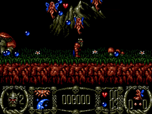
This is level one. Gorgeous isn't it?


Level 2 is a lot harder than you might imagine. I should replay this someday!


Like I said in the review, level 2 has some nasty nasties!

Friday, June 21, 2024

Sam In Monster's Garden


The monsters are coming!

Every so often I find some kind of silly software that makes me smile for no peculiar reason. It doesn't have to be a game, just look at the Steve or BoinkSave articles. That's what I love about the Atari ST, the history is immense but can also be surprisingly frivolous. Well, here is a game that made me grin like the Cheshire Cat so I had to play it.

Sam in Monster's Garden was released in 1995 for the Atari STe by Sebald Loic [aka Sam23]. That's right, STfm owners should leave, because this game supports the Blitter, extra colours, and DMA. Now that you're expecting big things? Well, these images show that it's similar to Dig Dug with its screen laid out like a maze with several items to collect.

Remember, this is public domain! Okay? Right, let's check out a couple of screenshots...


He smiles but still looks rather worried. Or drunk? Yes, drunk, because of that walk!!


The yellow monsters are pretty dumb but often massive in number.


Dig Dugging through the garden

Sam in Monster's Garden is a simple game. Sure, it's a ripoff but I like it. Walk the screen, gathering the various items and, once all are collected, exit to the next level. Dead simple. Well, it would be but for the monsters! After all, we're in their garden so I guess they're not happy about us being there? From what I've seen, there are two monsters:
The yellow ones aimlessly wander whereas the purple ones come crashing in and can carve their own path through the garden. Each will materialise a few seconds after you begin a level, which offers a moment of grace. However, once they start to appear, their numbers are plentiful and they spawn fast and regularly.
However, there are ways to kill these dreaded beasts. The first is to use the garden's apples. Walking under these loosens the soil and they fall, crushing anything underneath. Another way is to push them Pengo-style. Lastly, we can use a gun that fires one bullet at a time. This bullet bounces around the open areas until it hits a monster (can be recollected).

That's all there is to this bizarre little game; collect the items as quickly as possible and begin the task again on the next level. As you progress, the difficulty increases with more enemies adding to the frantic gameplay. It's a bit mad!!

Hardly original but, it's silly and I'm positive the kids will love it. Let's check out some more screenshots...


I was panicking here as I had one last fruit to collect and these monsters are fast!


As you can see, they appear in droves but are as stupid as they are quick.


Aesthetics

Each level looks much the same; a basic green background with different places for the apples and other collectables. Sure, it's (umm) based on Dig Dug but everything is overly large thus creating a rather cluttered or claustrophobic feel later on. Apparently, the Blitter is used (for the sprites?) and the extra colours are displayed. Can you see 'em?

The sprites are the strongest aspect of the visuals with the monsters a quirky bunch with decent animation. Sam wobble-walks like Frankenstein's Monster and his dying animation is superb. Touch a monster and you'll see his body break up and fall to the ground. Fantastic!! Whether all this was Sebald's intention I don't know but, I love it.

The audio is very good with a boppin' chiptune playing in the background. The music is accompanied by a few DMA sound effects. It's hardly Death Chase for quality or quantity but good to have. Zero complaints here.

Hopefully, you've remembered this isn't a commercial game and are still here? If so, let's see more screenshots...


Broken body and dead. Reaching level 25 was my personal best.


In the following game, I bettered that to reach level 27. Sadly, I never beat this achievement lol


CryptO'pinion

If you have spare time to play something different from the norm, Sam In Monster's Garden is oddly great fun!! The gameplay has been kept simple, and I liked that, just collect the items, run around panicking, don't get caught, and repeat.

The first few levels are ridiculously easy and can be completed before any monsters appear. That grace period is most welcome later on when the action is frantic. However, it's these monsters that make and break the gameplay: 1) there are too many for a cramped screen. 2) there is some rather suspect collision detection that I fell victim to. 3) they can spawn where you are standing. I wish Sebald had tweaked these basic annoyances that spoiled what might have been.

I'd rate this around 55% as it could/should have been much better. However, I appreciated having something different to play and I'm positive your children will enjoy this for all its pointless mayhem. What do you think? Go on, download it and let me know in the comments below. I might then consider playing Sebald's other game, Sam In Monster's Land...

Sunday, June 09, 2024

Nano Cave


Deeper dungeons!

Like a lamer, I always enjoy following events like Silly Venture and the latest unleashed incredible art, music, demos, and much more (for all types of Atari). It's mind-blowing to think these gatherings still happen today and for a computer older than most of my friends! Anyhow, it was a #roguelike game by Electric Dreams that caught my eye.

It's called Nano Cave and was programmed in GFA Basic, a product that has helped produce loads of ST games (Well 'Ard, Saboteur III, Mystic Realm, PouifOuf, and many more). Now, I'm a massive fan of the genre so news of a new "Rogue" was exciting albeit with a pinch of apprehension of how it might compare to the games already in our library.

So, who are Electric Dreams and the guys behind the daunting task of taking on Rogue? They are an indie games developer and all coding by Shaoth, who also programmed 'Space Zot'. Pépé Peekpoke drew the graphics and is a member of one of the best demo groups ever - Hemoroids. That beautiful chip music is by DMA-SC, who certainly needs no introduction as all my readers know how much I adore his incredible musical creations.

Nano Cave has one major difference I never expected to see in a game - graphical skins. These can change the entire game's appearance so it looks like it's running on other computers - C64, ZX81, Amstrad, etc. This is a fascinating concept and a wonderful addition albeit purely cosmetic. Regardless, I loved experimenting with the different skins!

Older gamers are drooling over the prospect of playing with this? Let's see a couple of funky screenshots...


The first dungeon defaults to the ASCII skin for an authentic touch (that the kids will hate).


Check out the super-cool Atari 2600 skin. A 5200 skin would be cool ;)


Gimme the blurb

Brace yourself for brutal originality; the story goes like this: a magical item called the Amulet of Zendor has been lost. Hang on, Amulet of Yendor, right? Erm, no. Anyhow, why this keeps getting lost I don't know. But I know this much, it's been lost inside a treacherous cave with a promise of mystery and danger. Who can resist that challenge? Not me.

Upon booting, a fantastic intro plays with superb music. Well, it is an Atari ST game. Okay, hit the spacebar for the main menu where you can choose from many different options and also play about with the different graphical skins. There are many to choose from - or you could leave the game to automatically cycle through them. It's up to you.

Note - this is a work in progress. There are some anomalies and missing graphics plus I also had more than my fair share of crashes in emulation. I had far better success on my real Atari STe. Thanks to Kev for his help :)

Okay, let's stop the chitter-chatter as we need to enter the dungeon! Oh yeah, let's see more pixels...


The main menu - as you can see, I've changed the skin. Which computer did I choose?


In this game, my ST thinks it's a ZX81 and the dungeon is scary in black & white.


Gameplay

Nano Cave is very similar to the original Rogue games in the sense that we're plundering a multi-level dungeon looking for an amulet. Of course, the dungeon is a labyrinth crammed with nasties and lots of traps. It's not all bad thanks to randomly discarded items we might find, everything from armour and weapons to potions and spells.

Ignoring the first level, the dungeon is randomly generated in terms of the layout and its 26 creatures lurking in the darkness. The game is viewed from an overhead perspective with the rooms and corridors gradually revealed - so items and monsters are only seen when close. Inside the dungeons are emus, kestrels, ice monsters, bats, etc. Later levels have zombies, aqators, crabs (these can be tough!!) and some I've yet to discover: dragons, medusas, and Quaggas.

Controlling our cute protagonist is a cinch using the cursor keys for a 4-way direction. Battling nasty creatures and picking up items is simply a case of 'bumping' into them. As you get close to an enemy, a pop-up appears detailing their stats. That might help you to decide whether to fight or flee. Just keep on bumping your foes until they are no more!

A "HUD" shows our current statistics and moves from top-to-bottom depending on our position. Pretty nifty but, if it bothers you, hit the "H" key to hide it. From left to right, it shows the following: our current level, hit points, strength, armour, gold, XP, and hunger. These are self-explanatory but note that HP improves as you explore as there is no rest key. Food is a remedy for hunger/fatigue. Any pickups can help to strength/armour and XP increases after a kill. Multiple ranks are awarded, but only when you've earned enough XP, which results in extra HP for a tougher fight.

A rudimentary inventory can be accessed by pressing any key but, oddly, I always press "I". This menu operates intelligently using the same cursor keys: Up/Down to select, Right to choose, and Left to cancel. This is superb but the Inventory itself is lite on function and missing generic features I would have liked. For example, there is no way to compare stats for weapons or clothing with what you currently wield. Just don't be silly and replace your sword with a dagger...

Hacking your way through the dungeon is great fun and a simple affair without depth. Heading further into the dungeon, the levels are more complex with extra traps and monsters are much stronger. Yes, Nano Cave is tough; the best I've done was reaching level 10 (on the previous levels I landed lucky with the right pickups - before being slain by a crab!).

If you ever find the Amulet of Zendor, you should retrace your path through the dungeon. However, I doubt I'll experience that as level 10 was cruel enough. Permadeath is featured so explore carefully. Hey, what did you expect?

Nano Cave offers the genre a new and modern twist and I'm loving it. Let's see some more screenshots...


In true permadeath, I died and restarted using the stunning Atari ST skin.


The inventory screen is rather limited but functional to a point.


Magic & stuff

After the initial level, all items are placed at random locations in a random maze - food, gold, weaponry, clothing, or something special like a scroll or potion. Sadly, not everything appears to have a function; many weapons didn't change my stats and similarly for armour much of the time. Food compensates for the fatigue warning that pops up regularly, a possible red herring I reckon. Gold is purely cosmetic and something those little Leprechaun fellas love to pinch!

The most interesting pickups are potions and scrolls that provide a wealth of positive and negative effects. However, there are some yet to be implemented so these will do nothing more than tease you with a dialogue box - it hints to wait for the next release. Argh, I hope that is real soon!! Okay, let's take a quick look at these two types of items:

Potions - come in a variety of coloured bottles (white, blue, green, pink, burgundy, clear, red, brown, plaid, yellow, grey, beige, and black). It's best to identify these or run the risk of a cruel gamble. Some might increase health or strength whilst others can show the locations of monsters/treasure/magic. However, those gamblers with little good fortune could find themselves paralysed or teleported into a dangerous place. Worst of all is blindness!

Scrolls - once again, these will need identifying as their description is a bunch of jumbled lettering. I thought that might have been an alphabet puzzle to solve but no code breaking worked. So, identify first otherwise you might hear the distant cry as a monster materialises nearby!! Interestingly, level one always has a scroll to reveal where the monsters are hiding. That is far too powerful to use on any opening level(s) so deffinetly worth keeping.

It's always a gamble - do you wait for an identification scroll or run the risk and take a chance? Personally, I think it needs more identification scrolls to balance it out. However, this does help to create massive stress and anticipation!

Yes, I'm so looking forward to future releases so let's view a couple more screenshots while we wait...


Some potions/spells are helpful. Like this - it shows where all the monsters are located.


A scroll to identify any item is well-advised. Otherwise, it's quite the gamble!


Achievements

That's right, every game you play is a chance to complete some type of achievement. Everything you can imagine from the game is featured and archived into an alphabetical list. This includes all encounters you've successfully overcome plus silly ones like filling up your inventory, starving yourself, and a chest grabber (I kid you not). A superb addition!

Again, because it's WIP, some of the artwork is absent, I hope this is finished for the next release. It's a brilliant feature of the entire game and the artwork is glorious using a dark, gothic effect. Actually, it's jaw-dropping pixel art.

Okay, it's time to pause the boring reading for funky screenshots of my achievements...


I always felt mean killing kestrels! But here, it's a winged bloke so I don't mind so much!


Why are emus in a dungeon? That's weird but, let's kill as many as we can!


Aesthetics

As you can tell from my enthusiasm in the previous section, I love the graphics. Thankfully, the game itself is also fantastic thanks to the sheer variety of the skins. It's funny, but when I first began playing Nano Cave, I was weirdly impressed with its authentic ASCII display. I hardly use that now because I can select older computers like the Apple II, PC CGA, Amstrad CPC, and Sinclair ZX81. These are gorgeous and drastically change the game's appearance.

The Atari ST skin is best - because it is. But you should still experiment and check out the others. I like the C64 graphics - please don't shoot me. Pépé has blown me away with these skins and it's great having this variety. This idea is far beyond great and I imagine it took some effort to fully implement. A monumental feature I never expected!!

As for the audio, there are no effects - not that I expected any. Instead, we have music composed by one of my favourite musicians, Mathieu Stempell (DMA-SC). Sometimes background music doesn't suit a game, sometimes it gets disabled, and sometimes it's rubbish. Not here. The background music is superb and perfect for a rogue's adventure.

Oh yes, not only do we have a new #roguelike but it has funky sounds & pixels!! Screenshot time...


The C64 graphics are superb using a clear design and stark colours!


Sadly, I had lots of quirks using an emulator. Ran a zillion times better on my real ST.


CryptO'pinion

I don't consider myself an expert in the slightest but, #roguelikes are something I love. Rogue is one of my favourite Atari ST games and I've spent hours plundering its levels - I've accepted that I'll never come close to recovering the Amulet of Yendor but I have my fun. So, hearing about Nano Cave was a mixture of shock, worry, and considerable joy! I'm always eager to discover new ST games but I was apprehensive about how it would compare to what we already have.

Nano Cave might be a work in progress so there are a few niggles, but it does not disappoint whatsoever. Its gameplay is straightforward without much of a learning curve or pesky complications, so it's quick and easy to play. From the start, you are exploring, using items, and killing dungeon beasts. It's more of a #roguelite and I appreciate that.

Once again, the power and versatility of GFA Basic is proven by Shaoth & Co. who should be proud of Nano Cave. I've truly enjoyed romping through the dungeon and, one day, I hope to beat level 10. You should wait no more and download this wonderful game right now. My rating (for the current release) is 89% and I eagerly await the next update.

Let me know what you think of Nano Cave in the comments below. Happy dungeon crawling!!


Each level has an information panel about your current game progress.


This green PC skin is quite peculiar but it grew on me after a while!


The Apple II skin is probably the weakest of the lot thanks to its wacky colours.


Monster Detection has been used with the PC's CGA skin. Ugh, PCs!!


This is the NES skin. At first, I first thought it was plain but I genuinely love it.


Ironic, I own a Mac and hardly ever select this skin.


Along with the bats, Ice Monsters often don't care much about you. An easy kill!


Sigh, I finally got to battle a Quagga...


Legends.

Friday, June 07, 2024

Belote


Gamblers Anonymous!

It's been far too long since I posted anything in our Box Art section! With that in mind, behold my latest purchase, and possibly my last (for a time). Belote is a card game, quite unlike what I would normally purchase but I'm always eager to try something new and support a company that loves the Atari ST as much as we all do.

As the box shows, Belote is by Jean-Stephane Martin for Côté Gamers, the same guys that published L'Abbaye Des Morts, Iceblox, Toogle, and the marvellous Democyclopedia book (use SEARCH on the right). Originally, it was to be released in 1989 by ESAT Software but they went bankrupt so it was doomed to wander the forgotten deserted wastelands.

Decades later, Cote delivers a boxed version with extra features and three bonus games: Le Pendu, Master Mind and Simon. The box is of the usual high standard that includes an exceptional manual - this is superbly written with loads of extra information I never expected about the author, his story, the history of this game, and much more.

The 80s and 90s are long gone but I don't care. These glorious times are still rocking in my 16-bit world!

  • Obviously, there isn't a download but you can see a video recording on YouTube.
  • You can view Jean-Stephane's entire catalogue on Atarimania.
  • I would also like to personally thank Cote Gamers for going the extra mile - despite the nasty intentions of the French postal service! Click here for all their other Atari ST products.

I look forward to getting my teeth into this game and hopefully, I'll learn a thing or two. However, at the moment, I have no idea what's going on and have lost every game (no change there then). Yeah, I have a mountain to climb!!

Okay, wanna see what's inside the box? Of course, you do so carry on scrolling...


The back of the box. This is gripping stuff, right? ;-)


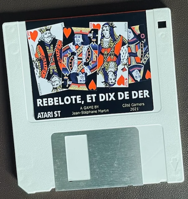
What's better than buying a new product in the 21st century - and it's on a floppy disk!


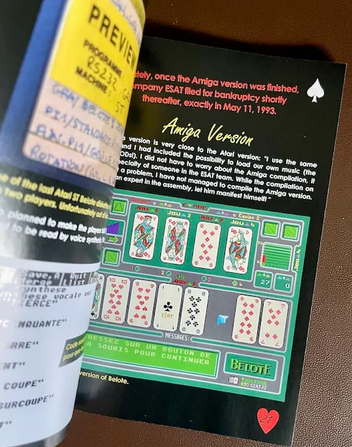
Cote Gamers excelled themselves - the manual is a corker!!


Oh, if only you could feel the pages flick through your fingers. You're missing out!


The manual has a wealth of information about the history of the product and more.


What???  Hey Cote, I want my money back!!

More random ATARI ST articles from the archives

Like what I do? Hey, do you wanna help support AtariCrypt??