Thursday, January 19, 2023

Rotor


One for the collection?

In the not-too-distant future, everything will be impossibly expensive with jobs becoming scarce and no decent opportunities for the majority of us (now that's quite a scary prediction). Perhaps we should quickly move on? Thankfully, there is the prospect of joining the Roto-Raiders who pilot huge tanks through dangerous caverns all for a lucrative reward. Only the brave need apply because the missions are deadly. Dare you sign up? Of course, we do so count me in!

Gravitar-Esque games are popular for the Atari ST and we have some killer titles that are extraordinarily awesome - Oids and Thrust instantly come to mind. However, that means Arcana had to bring something new to the table in order to stand out from the crowd. Plus I naturally had high expectations considering the strong competition!

Before we crack on, I blindly bought Rotor off eBay as it was going cheap! So let's take a look at all the goodies...


Yeah, it's hardly in perfect condition but it's pretty good and I like the design too.

  
Hmm, mind-blowing content, right? Yep, minimalistic but it's nice owning a piece of hiSTory.


Get to it, I wanna blow stuff up!

Okay, Rotor is a game much like Thrust with numerous tasks split into separate missions. We begin with a training simulator to learn the controls and how to collect items and kill enemies. This is a great way to understand the basics and grasp its user interface. Oh, and the training needs to be fully completed before moving on to the real missions.

Once it is, you can attempt each of the missions in many different environments - earlier levels are quite tame compared to the torturous ones later on. Every cavern has antagonists (as the manual loves to say) who are enemies like Cannons, Laser Guns and Gravity Generators. Some can be destroyed whereas others can be temporally disabled.

Our spaceship is a large circular craft with adequate but sluggish manoeuvrability. Physics plays a part, so there is gravity to consider and you can only accelerate in the current facing direction. All caverns are pretty vast but feel claustrophobic due to the bulky ship size - with its lacklustre abilities so feels leaden compared to Thrust or Oids.

All missions follow the path of needing to complete requirements like shooting Container Pods for their contents. Destroying them and killing as many enemies as possible rewards lots of extra points. Sadly, all this is within the time constraints of limited fuel and armour. Once you're finished, exit coordinates detail where to go in order to escape.

Simple stuff, so let's take a peep at a couple of early screenshots...


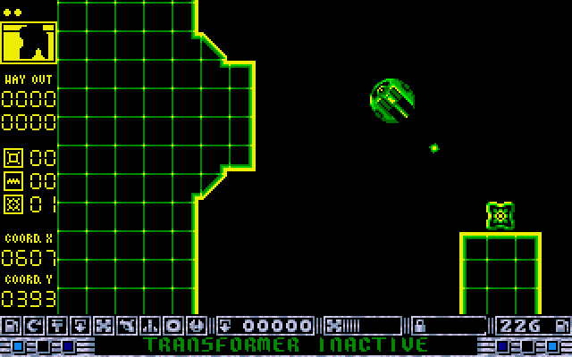
The training missions are a fantastic way to learn the ropes.

In this simulator, we only need to shoot (and then collect) what's in that box. Easy!


Power-ups & other stuff

Rotor could have been a very simple game of shooting/collecting stuff and leaving. But it's not. Arcana obviously thought this would have been far too boring so jazzed it up with pointless clutter. Let's begin with its user interface...

On the left-hand side, is a map detailing your position, the dots above that are your remaining lives. The coordinates of zeros will change once the mission is complete to show the exit location to rendezvous (the other coordinates are your current location). The three icons between these are 1) the time left until a bomb explodes. 2) The time left until a disabled laser resumes. 3) The required number of crystals to gain exit coordinates.

At the bottom of the screen is the radar and this shows helpful information like the state of your armour, cargo, and remaining fuel. However, it also displays potential enhancements that can be gained by collecting pearls. For example, the second icon is for the ship's rotational speed. The third icon improves upon its lethargic thrust.

Hang on, what was that about Container Pods and Pearls? Container pods offer a variety of goodies like fuel, upgrades, explosives (potential traps) and sun crystals (to exit the level). Pearls can affect the performance of Rotor significantly: collect two and the ship rotates faster. Pick up a third and you have the choice of upgrading thrusters.

However, I cannot help but wonder why these needed to be earned rather than come as standard? It feels unnecessary to upgrade the ship during a mission instead of concentrating on the task at hand. Why complicate things?

Anyhow, let's take another look at some more screenshots from my victorious venture...


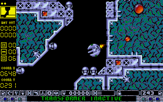
I would advise blasting those gun turrets before attempting to sneak by.

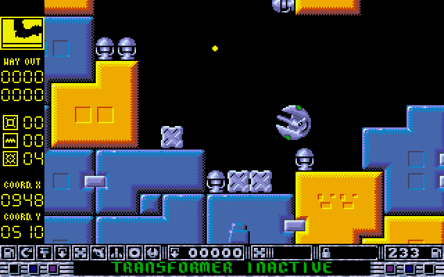
Things are getting hectic in lego land which is very difficult to manoeuvre through.


Tips and level codes!

* Don't even think about skipping the training missions. Trust me!
* Bombs automatically activate after first shooting the pod. You have two options, leave the screen safely and survive or collect the extra cargo and take it home.
* Beware of how much cargo you're carrying. Extra weight means a slower ship using more fuel.
* Watch the walls, take your time and let the scrolling catch up with you.
* If something is able to shoot at you then it's best to shoot that first and clear the way.
* I hate to say this, but don't worry about ship upgrades as this wastes time (and fuel).
* I said don't skip the training but, if you really can't wait, here are the level codes:
Level 1 = GAG,
Level 2 = LIP,
Level 3 = SLY,
Level 4 = MEW,
Level 5 = AWE,
Level 6 = TNT.


As tough as it is groovy-looking. Must admit, I do love the weird palette!

Argh, this level looks so passive but is insane! I died straight after taking this screenshot.


Input & Output

Controls are as familiar as you expect: fire button to (erm) fire, upwards to thrust and left/right rotates your craft. I doubt there would ever be any reason to change this asteroid-ripping formula because it's tried, tested and works great. However, my problem is the craft's manoeuvrability which is far too sluggish by default, and that's a bit rubbish.

Graphically, Rotor is really nice with a futuristic/Tron-like feeling for the training simulator. Later levels look funky with colour and a neat design that feels 8-bit in some respects. The screen scrolls in all four directions quite smoothly but it will struggle to keep up with your ship if go too fast. Hmm, at least that forces you to be more careful I guess?

Sounds are acceptable albeit not the best you've heard from your ST. There are various effects for the engine, shooting, enemies, etc. All hold back the deafening silence of space and make Rotor pretty much what you expect.


Later levels are far too hard (for me) because there's too much going on for your sluggish ship.

Another later level which has far too much going on for my reactions to cope with!


The CryptO'pinion?

I've enjoyed Rotor but not nearly as much as I should have. Don't get me wrong, Rotor has some good points like the training missions and groovy graphics. However, it then complicates what should be a fun shooter for no decent reason at all. The worst is the absolute necessity to upgrade your ship rather than it being optional. That doesn't make any sense.

There's a lot to moan about I guess? Well, believe it or not, I have enjoyed Rotor because it's nice to play something new. But let's not kid ourselves, it's bordering on mediocre when compared to Thrust and Oids. Close but no cigar!

PP has adapted Rotor to be run from a hard drive and Old Games Finder has the floppy disks.

Saturday, January 14, 2023

Prehistorik


I've missed clubbing animals!

Incredibly, it was 7 years ago that I first featured a game by Titus called Prehistorik (go on, click that link). Unlike most games programmed in STOS, I found this cute, playable, and instantly very addictive. So I figured I should map this beautiful platformer right away and there are many more web pages of mapped Atari ST games here. Check 'em out!

Okay, it's been superb playing this game again and I still appreciate its simplicity; each level is pretty much the same albeit with different graphics and a few extra baddies. That's no bad thing, I hate it when developers attempt to bulk up a game with extra stages that often end up overbearingly bloated and unnecessary. So, it's great to see Titus sticking to their guns with lots of mindless animal bashing and yes, I have not changed my opinion of Prehistorik whatsoever.

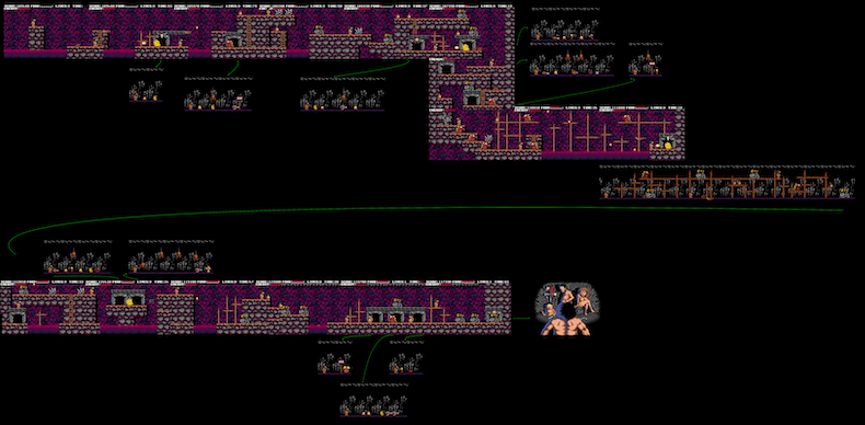
I've tried to map everything correctly with all the items shown properly. This includes each of the caves and the secret rooms - I've added directional arrows to help navigate properly. Prehistorik has been an absolute blast and I hope you enjoy these maps as much as I've enjoyed making them? Let me know in the comments below if anyone's here?

Here are a few sneaky thumbnails of what to expect and you can download the hi-res images by clicking here.

Level one is very easy to play and features lots of caves with a few hidden screens.


Perhaps it's now I should warn of spoilers? Nah, download the maps and enjoy it for yourself!


Things are getting tough with new monsters (I really like those crafty snowmen throwing snowballs)


Actually, the snowmen are very tricky and this level has some formidable screens. The boss is rubbish...


We're in the woods for the penultimate level and guess what? It's a brilliant level!!


Well, except for those squirrels who throw their nuts with such annoying accuracy. Ooer!


The final level is a belter, and really enjoyable with great gameplay. I genuinely loved it!!


After all your hard work you return home to the family. Hey, check out my wife!

Sunday, January 08, 2023

Badlands Pete


On a steel horse, I ride. I'm wanted, dead or alive...

Sorry, I just had to get that in. Okay, let's crack on... ARC released Badlands Pete in 1990 and is an action-adventure set in the American wild west. I love anything like this, so couldn't play without the attire - I'm wearing a stetson, chaps, spurs, etc. This helps me to write even though the wife laughs at me. But I know that I look like Clint Eastwood. Honest.

Badlands Pete is a platformer that incorporates a pseudo-3D method of walking in/out of each scene. It's a bit like what we saw in Fred and they're calling it Strip-A-Mation, which is quite a cool name. Using this movement alters what's visible. So changing position might mean seeing additional objects along with the ability to navigate differently.

This is a really neat idea that adds depth to the mechanics of each scene and allows freedom to explore everywhere in separate ways. Well, that's if it works properly, otherwise, it could be cumbersome and messy therefore totally ruining the game. Sometimes it's best to keep a platformer simple so we can concentrate on just playing the game!

Anyhow, let's take a look at some screenshots from the 16-bit American frontier...


This is where we begin, riding into town on a Union Pacific train. Nice!


There's a shifty-looking cowboy to our right. Try to chat with him and see how he reacts!


Get out of Dodge!

Arriving in town by train, the task is to rescue the Governor's daughters who have been kidnapped by ruthless thugs from the Badlands. He enlists the help of Pete Coyote, aka Badlands Pete, to get them back. Yep, that's you - the quickest draw in the west. However, my first game didn't go very well and I soon realised the town is full of irate cowboys, crazy Indians, sleepy Mexicans and other townsfolk who first appear to be innocently going about their business (don't be fooled!!)

First things first, the controls are easy: walking left/right is obvious and you can also move in/out of any scene by pushing up/down. However, I would practice in the comfort of the train station area before daring to explore the town itself. Your guns are drawn/holstered by hitting the spacebar with the fire button to shoot.

The user interface shows Pete's energy levels, our score and ammunition. Energy is obvious and when Pete is shot, his bleeding heart needs replenishing with food & drink. The belt of bullets is for ammo - running out leaves you defenceless in this insane frontier so top it up whenever possible - dead bodies are a great source to find goodies!

The score is shown as a dollar bounty which goes up when collecting items or killing someone that's already decided to shoot at you (beware: a negative bounty equates - to others - your worth to them). Finally, the ladies you see at the bottom of your screen are the governor's daughters who require rescuing for a lucrative reward. If you live long enough!

Let's take a look at some more screenshots from my "victorious" gameplay...


I entered a room and was ambushed, for no reason, so I killed him. What's wrong with these people?

Arrrgh even a preacher pulls out his weapon (again, for no reason) and then starts shooting!!


Gunfright!

As you begin, a Wanted Poster depicts the task at hand with the reward. Walking around is kinda cool if I'm honest thanks to the stunning artwork using an arid colour palette. Leaving the station depo for the town reminds me of Rio Bravo and other westerns. Almost all characters have a dollar value but it pays to be coy rather than trigger-happy because those who draw first aren't well respected plus serial killers only end up as wanted themselves... think about that.

After only a short time you soon realise everybody is out to get you. It's rare to walk close to someone who doesn't pull out a weapon in aggression. Most people are nuts, even the preacher wanted me dead! After a while, this constant pointless onslaught is irritating as it halts any chance of progress because you're constantly fighting off everyone.

You can help yourself to various things that replenish your health and ammo: look out for items like a hot pie cooling on a windowsill or a box of ammo, etc. It's worth remembering where these items are usually located because it won't be long until you're backtracking in extreme desperation. And this is constant throughout your gameplay. Yes, constant.

In all honesty, I didn't understand why most characters needed to have such hostile actions. It's not like there are unlimited supplies lying about town to compensate! Anyhow, I think we need to see a couple more screenshots...


Great, now the Indians are shooting arrows at me. Why? I didn't do anything to provoke him!

Oh joy, I walked into the sheriff's office. What happened? Of course, another shooting match!


Aesthetics

I'm a big fan of westerns and I love the old John Wayne movies the most. Badlands Pete is a cartoon representation of that era and it works remarkably well. In fact, I adore the artwork with its dusty frontier for each scene as it reminds me of being in Wichita, Tombstone or West Texas. And that makes this old Atari cowboy very happy indeed!

Sadly, Arc somehow decided against utilising the Atari STe as they did with Chronicles Of Omega. Why I do not know because this game feels very sluggish. Slow to move and also slow to scroll. I think a little help from the Blitter would have been a marvellous improvement. Having said that, there is no reason at all that it's this bad on the STFM!

The idea behind Strip-A-Mation of walking in/out of each scene is superb. This, not only unveils objects that you might have missed but also suggests alternative ways to explore. This game design is by Steven Cain (Black Lamp) and Badlands Pete appears to have evolved somewhat from that. I admire what they where trying to do.

Musically, things aren't bad at all with a title screen tune that sounds great considering ARC foolishly made no use of the Atari STe. Gotta say though, I liked it a bunch! Sadly, the in-game effects are quite lame by comparison. I'd have loved samples from Westerns like Rio Bravo or A Fistfull Of Dollars. Heck, any stock samples would have worked.

Feeling like a bit of a rushed port, isn't it? And by Atari too! Hmm, here are a couple more screenshots...


Hey, this town has a mine. Let's use Strip-A-Mation to walk in to see what's lurking below...


The steps lead off and down. I wonder what's here? I'll save you time - another pointless gunfight!


Hints & Tips

I did wonder whether it was worthwhile even writing this section. I imagine nobody has scrolled this far so I could probably write whatever nonsense I like? Hmm, Atari Legend sucks. Commodore wimps love to whine like big crybabies. ARC hated the ST. Commodore is the best. I love Amigas. Amiga forever!! I have never owned an Atari ST!! I'm pregnant!!

That was fun but I think that I better write some tips, which is extremely difficult for this game...

* Have many practice games and learn the controls, especially with regards to quickdraw.
Don't get too close to somebody you intend to have a gunfight with. Very weird!!
Be patient, let the bad guys draw first. I know, I know...
Never draw your weapon in front of a lady. Ooer!
Look for items and also top-ups for health and ammo.
Don't go looking for trouble, run away if you can. If you can...
* Arc obviously had no beta testers so we desperately need a trainer!


I entered the town's jail. Looks quiet, right? No!! After I took this screenshot, they began firing!


This is a screen that you will see a lot!!


The CryptO'pinion?

I'm not exactly sure where to begin... Okay, I love the idea behind Badlands Pete but it's far too difficult so I failed to make much progress. No matter where you go, someone pulls out a weapon and begins firing. It's weird and this relentless attack soon becomes irritating, especially as you find yourself repeatably looking to replenish health and ammo.

The idea behind Strip-A-Mation is great but it would be more suited in an adventure rather than here because it's too fiddly to be functional at speed. Along with Carlos and Chuckie Egg 2, this is possibly one of the worst games I've featured here on AtariCrypt. Ignoring the theme, and excellent visuals, I've nothing much more to say about Badlands Pete.

Sigh, for those still wanting to be a lame version of John Wayne, download Automation #409. Good luck!

Friday, January 06, 2023

Street Fighter


A disgruntled gamer

Back in the summer of 1988, I was the only guy in college with a ZX Spectrum. Don't get me wrong, I loved my old Speccy but I had grown out of it and spent much of that year dreaming of Atari's new supercomputer. It was tough seeing magazine game reviews because the Atari ST games appeared to have graphics lightyears ahead of the current competition.

However, I will always remember the advert for Street Fighter because it featured screenshots taken from various systems, the Atari ST being one. It was a jaw-dropping moment seeing such amazing details and bright colours (the image above). In reality, the advert was a lie because that image was actually taken from the arcade version!!

Not that it mattered because this beat'em up was something of a shambles thanks to Tiertex chimps randomly hitting their keyboards until they thought it was ready for release. I honestly don't know how they got away with this product - it's not only the jerky scrolling and laughable animations but the control system is sluggish and vastly unresponsive.

Of course, after months of yearning for the Atari ST, I finally got one at Christmas. Ignoring Street Fighter, this slab of grey power lived up to all my hopes and desires and you can imagine the joy on my face when I first got to boot up Xenon, Buggy Boy or Beyond The Ice Palace. Magical moments in my history. (Atari STFM Super Pack)

If you're still interested in playing Street Fighter then you are obviously insane, but here are the links...

8BitChip has the download for hard drive/ultrasatan installation.
Floppy disks can be found using Old Games Finger (Automation #41)
Wasabim has recorded a fantastic YouTube video!
Type "STREETCHEAT" on the title screen and you can hit the Help key to skip levels.
Maybe you're curious how Street Fighter would have performed on the Atari STe? (unfinished)
Hey, why not check out our Beat'em Up section, go on and click the links!
 

Even though a trainer was enabled, I endured much pain to get these screenshots! I wanted to play through until the end, but it seemed to go on forever so I was thoroughly braindead and gave up. Anyhow, we're here for the (static) pixel art so I'll stop moaning about that advert and game. Dare I ask if there are fans of the ST beat'em up out there!

I hope you enjoyed this silly little post by a disgruntled gamer remembering US Gold's misleading advert? O_o


Look at him trying to punch me even though I've jerkily leapt 15ft in the air.


Look at the magazine advert and then try and tell me that it's the same as the ST game!


Look at the size of this bad boy. Hmm, let's punch him in the nuts - that'll work!


Another giant dude to fight, so I decided to cower in front of Ian Dury's little car heh.


You'll see something like this at the end of each stage. Great, uh?


Look at all those strange faces watching. Quite scary!


Another clipping of the advert (enhanced using online tools, hence the weird text)

Monday, January 02, 2023

SDI: Now The Odds Are Even


The Star Wars program is happening!

Wow, it's incredible how quickly time passes as I've not played this game since I got my first Atari ST. The Sega arcade shooter was converted by Alaric Binnie of Source for Activision and released in 1988. I remember being impressed and unimpressed in equal measure - probably because I liked what I saw but was absolutely terrible at playing it!

As most of us, older gamers might remember, SDI stands for Strategic Defense Initiative and is based on the original Star Wars concept by President Regan devised during the cold war. This technology was supposed to defend Earth (USA!) from the inevitable Soviet attack. Yeah, I know, it never happened... shocker, right?

The game is obviously an action shooter set within the darkness of Earth's space. As it turns out, the defence initiative is actually just a lone satellite armed with a laser gun! Use that to protect mankind from a legion of Soviet nuclear missiles, fighters, and more. Why only one satellite I don't know but, that's the game, so let's crack on...


Soviets are sending everything they have. Well, in stages thankfully.


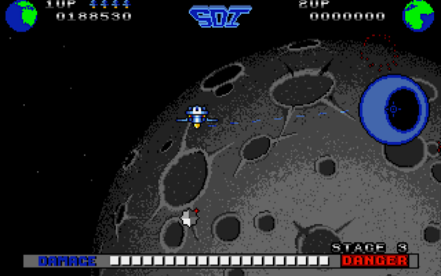
At first, it was distracting to see the moon moving by. I should have been concentrating!


The fate of mankind...

Our quest begins with the Space Shuttle conveniently dropping us off right before a barrage of Soviet missiles appears. The game is split into two separate modes depending on your performance, offensive and defensive. The first is not unlike other horizontally scrolling shooters attacking everything that swarms onto the screen. The second is like a 3D Missile Command and a final chance to save everyone from the previously missed missiles.

You'll soon discover that SDI isn't a complex game at all. This is a frenzied shooter with us engaged in battling squadrons of enemy artillery. So shoot everything as quickly as you can physically move the mouse. Of course, each stage gets more aggressive, right up until the point my hand-to-eye reactions simply cannot cope anymore (see the video!).

No need to fret, you're not alone as allies will periodically send power-ups. However, during the heat of battle, these look similar to everything else! Especially when you're in a mindset of blasting everything as quickly as possible. So that means they're immediately destroyed - far too soon to collect their cargo that you watch floating away. Sigh...

A damage meter is shown at the bottom of the screen which is an indication of the state of your performance. Survive, and the Space Shuttle reappears to whisk you off to safety where that performance is rated on a scale. Anything less than perfect and you're sent through to a defensive stage to help defend from the attack. However, a perfect score gets you lots of extra points with a blue dancing duck. (I know what you're thinking and I agree - this makes it all worthwhile!!)


The blood-red moon looks awesome. Don't admire, concentrate on the killing!


I let some missiles get through so now I'm defending the base Missile Command style!


Input

Initially, SDI might appear tricky because you have to do two things at once - keep the satellite safe and choose the direction in which it fires. Arcade games can sometimes lose their functionality when converted to a home computer with a one-button joystick. Not so here, all controls are fully configurable using a combination of mouse, joystick and keyboard.

It is possible to use only the mouse, but I wouldn't advise that. I play using the keyboard to direct the satellite and my mouse to aim/shoot. A joystick would also be a good idea but only if it has good suckers to stick onto your desk! O_o

The keyboard/mouse method is kinda like the WASD/mouse combo used in FPS games. You'll love it.


It's not long before things get crazy with lots to shoot at. Trigger-happy heaven!


Ignore the asteroid shower because it's time to shoot more of that Ruskie hardware.


Output

Space is mostly empty so the good thing about a Cold War is having celestial objects as backgrounds rather than boring black. All graphics are by Bryn Redman who treats us to great images of the Earth, its Moon and an asteroid field - I believe later levels feature the Death Star? My gaming skills won't allow me to personally witness that. Hmm...

The darkness of space dictates a more sombre colour palette which suits the Cold War scene but there are some brighter moments to behold. I love the red moon that boldly stands out from everything else, it looks amazing. Sadly, there is some slowdown during later levels that are bombarded by tons of enemies. Meh, I can live with that as it's not too bad.

Paul Summers is responsible for the audio and he did a stellar job (see what I did there?). The title screen features a grungy sample but nothing compares to the glorious in-game chiptunes. These are subtle and suit the ambience whilst also complementing the zappy sound effects. To say I adore the (in-game) tunes would be an understatement!


Come on, the defensive stages really are Missile Command. Rip-off but brilliantly done!!


Do well and make the hi-score table. Hang on, this feels like a game in itself? ;-)


The CryptO'pinion?

SDI could so easily have been a bust due to the control system (not to mention the massive graphical requirements). Alaric Binnie has done a fantastic job, not only aesthetically speaking but also migrating the arcade's control system over to the ST by using its keyboard/joystick and mouse. This combination works a treat, a commendable effort.

However, I usually find something to moan about and SDI is no exception. I failed to see the logic in having a dark blue cursor that can be problematic against the backdrops. Also, the power-ups are so difficult to catch. No, impossible (for me) to catch!! Finally, why aren't we treated to a nuclear explosion at Game Over. Oh, how I wanted to see that...

This is a simple shooter at heart with little depth. Some might say it's an alternative Missile Command and I get that, the similarities are there. SDI is an exciting shooter and one that is utterly addictive albeit I'm shockingly bad at it. Make sure you choose the control method that suits you to prevent Western civilisation from catastrophic demise!

Let me know in the comments what you think about SDI (download for hard drive or floppy disk)

Monday, December 19, 2022

Cybernoid maps


We're back!

Hello everyone, it's been a while since I last updated my website. Due to different reasons, I've had little time to play and write reviews, which meant putting everything on hold. In fact, 2022 was even the year I almost threw in the towel but things are getting better so I'm back and ready for ST action. Hey, wasn't that a magazine?

Anyhow, whilst playing a couple of ST games, I came up with the notion of making maps. Now, if you've been following AtariCrypt for a while, you shall already know that I'm a sucker for making maps with pen and paper. I guess these are more like rough scribbles in Steve-talk? That is great for me but, I wanted to make something 'better'.

As you have guessed, I have begun my quest with the Hewson blaster, Cybernoid. Ignoring the peculiar slowdown, this is a brilliant shooter and I'm a big fan. The ST game is a remarkable conversion developed by Tony Cooper with challenging gameplay and superb graphics plus audio that lovingly bursts the eardrums with stunning chip music. Okay, there is the odd killer screen which discourages some gamers - I don't get it, haven't they heard of infinite lives?

The mighty D-Bug have a sumptuous version featuring their excellent presentation style.
The man himself (PP) has adapted Cybernoid for hard drive installation.
Atari Legend has an excellent review, which is more than my lazy website can offer! :}
Eurogamer has an interview with Raffaele Cecco creator of the original game.
(sadly, I've not been able to source anything similar for Tony Cooper)

I must say, this new mapping venture has begun strong and I'm proud of myself for completing the first three levels. However, the fourth has a killer screen that I cannot beat. No matter how much I try, it's simply too tricky for my meagre gaming skills. So I'm leaving it be (before I violently damage my already-dodgy joystick in anger). Can't win 'em all but, I must admit, I've done better than I originally imagined. So yeah, I'm happy with how this turned out.

Here are the Hi-Res images that I know you're all itching to grab and print out - thx Atari Legend for hosting!!

Merry Christmas and I wish everyone all the beST for 2023. Heck, even the Commodore boys too ;)

Level one is shockingly easier than most people think. If I can do it...

Careful timing and furious fire button-bashing are required more than ever for the second level!

Nobody will ever play Cybernoid without infinite lives and the third level demands that so much!!

This part of level 4 is oddly incomplete because I'd overwritten my saved game... :(

I really enjoyed level 4, right up until THAT screen. I never managed to beat it :(


Greetings to all of our supporters, but especially Loggins, Tweety, Mug UK, Marko Latvanen & Peter Putnik for their friendship whilst AtariCrypt has been off the air - a fantaSTic community!! Thank you :)

Okay, get playing Cybernoid and let me know in the comments below if you managed to beat level 4.

More random ATARI ST articles from the archives

Like what I do? Hey, do you wanna help support AtariCrypt??